 |  |

Menu System Components
Menubars and Pulldown Menus
The Win32 System Menu Item
Classical Menubars
Popup Menus
Option Menus
Menu Virtual Events
Pie Menus
This chapter describes the menu system: its components, how to use them, and how they behave in a Unix and Win32 environment. Of primary interest are menubars and conventional linear menus (pulldown, option, and popup), although at chapter's end, we do visit a new kind of menu, the pie menu.
Typically, a menu contains commands that aren't used frequently, such as configuration options, File Open, File Close, Help, and so on. Commands that are used frequently may not be appropriate for menus and should be placed directly in the window to provide easier access for the user. Some examples of how menus might be used are for:
Creating a File, Edit, and Help menubar across the top of your application
Displaying a list of fonts from which the user can choose, with the selected font marked with a checkmark
Displaying a list of editing commands that become available when the user right-clicks on another object in your window (such as a Listbox or Entry widget)
Making a Menu pop up with a click of a button
You can build each of these different types of menus with the basic Menu widget.
First, let's take a quick tour of the components of a menu.
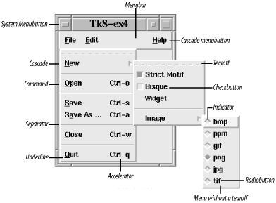
The foundation of the menu system is the Menu widget, a rectangular window that, as a result of some event, appears out of the ether and displays one or more columns of menu items. The event that causes the menu to appear is often the press of a Menubutton or keyboard character, but could just as well be a mouseclick or even a callback. The action of making a menu appear is called posting; making a menu disappear is called unposting. There are six flavors of menu item, shown in Figure 12-1: cascade, checkbutton, command, radiobutton, separator, and tearoff.

With the exception of a separator, clicking a menu item initiates item-specific behavior, such as executing a callback, posting a menu, or perhaps setting a Perl variable. We'll examine the various menu items in detail shortly. Briefly:
Clicking a cascade menu item posts another menu immediately to the right of the cascade. The new menu may have menu items of any number or type, including another cascade. A series of cascades are posted in quick succession from left to right, hence the menu item's name.
A checkbutton menu item works just like the Checkbutton widget described in Chapter 4, " Button, Checkbutton, and Radiobutton Widgets".
A radiobutton menu item works just like the Radiobutton widget described in Chapter 4, " Button, Checkbutton, and Radiobutton Widgets".
A separator menu item is a passive line used to divide a Menu into logical sections.
A tearoff menu item (when present) is always Menu index zero. After clicking a tearoff, you can drag the Menu somewhere so it's always available for fast access.
Many Menu methods expect a menu item index that specifies which menu item to operate upon. The following are valid menu indexes:
Every menu item is identified by an integer ordinal, starting at zero for the topmost menu item and increasing linearly downward. By default, each menu has a tearoff menu item that is ordinal zero (tearoffs are the dashed lines at the tops of menus). Pressing the tearoff reparents the menu by cloning it in a new Toplevel, so you can move the menu about in its own window.
The keyword active, which means the menu item that is currently selected (the mouse is over it and it is highlighted). If there are no menu items active, active means the same as none.
The keywords end or last, which mean the last menu item in the Menu. If there are no items in the Menu, end means the same as none.
A pixel y coordinate of the form @pixel_offset, where pixel_offset is an integer, relative to the Menu's top-left corner.
A regular expression matched against the menu item's -label option. Typically, referring to a menu item by label rather than by ordinal is preferred, because the code should still work even if the number of menu items changes.
Configure a Menu widget using the configure and cget methods, just like any other widget. If you're unfamiliar with these methods, see Chapter 13, "Miscellaneous Perl/Tk Methods".
Here are some other Menu methods:
Configuring menu items is analogous to configuring widgets, except that we want to limit our activities to one menu item; that's what the entryconfigure and entrycget methods are for. The format is:
$menu->entryconfigure(index, -option => value);
The index, which can be in any of the previously described forms, specifies which menu item to configure. To fetch the value of a particular menu item option, use:
$menu->entrycget(index, -option);
Of course, there are other things you can do with menu items:
Most nontrivial applications have menubars arrayed across the tops of their MainWindows (or any Toplevels for that matter). Arranged within a menubar is a series of menubuttons, which, when pressed, post menus. Unfortunately, these days the term menubutton is somewhat of a misnomer, because in modern Tks, the menubutton is not an actual Menubutton widget but a cascade menu item. This came about because of menu system support for multiple operating systems.
Prior to Perl/Tk Version 8, menubars were Frames filled with Menubutton widgets, and programmers were responsible for managing the geometry and appearance of the entire apparatus. Perl/Tk Versions 8 and above support a native look and feel for Unix and Win32,[24] so to keep menubar management simple and consistent from the user and application developer points of view, a new menubar management scheme was devised. The basic idea is that the menubar is just a standard Menu widget associated with a MainWindow or Toplevel widget, and cascade menu items fill the role of Menubuttons. In fact, these statements created the menubar portion of Figure 12-1:
[24] Tcl/Tk also supports MacOS Classic. We'll mention menubar support code for this operating system even though it's not currently supported by Perl/Tk. But Apple's next generation operating system, Mac OS X, is BSD Unix-based, so it's possible to run Perl/Tk with a Unix look and feel on a Mac today. Work is in progress to convert the Tcl/Tk widgets to native Aqua, so we may see Perl/Tk with a Mac OS X look in the future.
$mw->configure(-menu => my $menubar = $mw->Menu);

my $file = $menubar->cascade(-label => '~File');
my $edit = $menubar->cascade(-label => '~Edit');
my $help = $menubar->cascade(-label => '~Help');
To keep things simple, we'll call menubar buttons that post menus "menubuttons," whether they're real Menubuttons or just cascade menu items. Menubutton widgets are discussed in a later section.
The menu system is also aware of special operating system-dependent menubuttons, which is why the Help menubutton in Figure 12-1 is right justified (a custom in the Unix world). Under Mac OS, which always has a Help menubutton at the top of the display, Help menu items are appended to the existing Help items. Similarly, Apple menu items are prepended to the existing Apple menu items. Later on, we'll see how to augment the System menubutton on Win32 systems.
In summary, Tk 8 menubars have these benefits over the classical Frame/Menubutton approach:
Identical programming interface regardless of the underlying operating system
Native look and feel for enhanced user experience
Automatic geometry management of the menubar and its buttons (cascades)
Special processing for Apple, Help, and System menubuttons
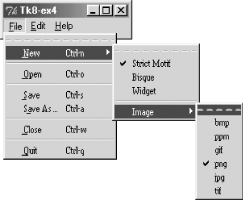
Figure 12-2 shows how the code that produced Figure 12-1 is rendered on a Win32 machine. In particular, note how the Help menubutton is not treated specially and not right justified.

As with any widget, there are options that affect how the Menu looks and behaves. The following is a list of the options available for the Menu widget:

Copyright © 2002 O'Reilly & Associates. All rights reserved.